Errors of Interpretation: Bad Graphs with Dual Scales
Posted on Mon 20 February 2017 in TDDA
It is a primary responsibility of analysts to present findings and data clearly, in ways to minimize the likelihood of misinterpretation. Graphs should help this, but all too often, if drawn badly (whether deliberately or through oversight) they can make misinterpretation highly likely. I want to illustrate this danger with a unifortunate graph I came across recently in a very interesting—and good, and insightful—article on the US Election.
Take a look at this graph, taken from an article called The Road to Trumpsville: The Long, Long Mistreatment of the American Working Class, by Jeremy Grantham.1
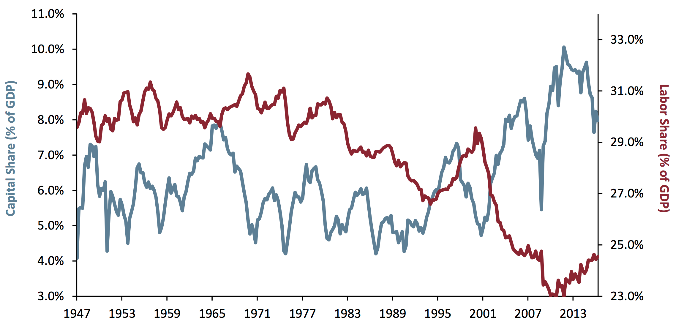
In the article, this graph ("Exhibit 1") is described as follows by Grantham:
The combined result is shown in Exhibit 1: the share of GDP going to labor hit historical lows as recently as 2014 and the share going to corporate profits hit a simultaneous high.
Is that what you interpret from the graph? I agree with these words, but they don't really sum up my first reading of the graph. Rather, I think the natural reading of the graph is as follows:
Wow: Labor's share and Capital's share of GDP crossed over, apparently for good, around 2002. Before then, Capital's share was mostly materially lower than Labor's (though they were nearly equal, briefly, in 1965, and crossed for a for a few years in 1995), but over the 66-year period shown Capital's share increased while Labor's fell, until now is taking about four times as much as Labor.
I think something like that is what most people will read from the graph, unless they read it particularly carefully.
But that is not what this graph is saying. In fact, this is one of the most misleading graphs I have ever come across.
If you look carefully, the two lines use different scales: the red one, for Labor, uses the scale on the right, which runs from 23% to about 34%, whereas the blue line for Capital, uses the scale on the left, which runs from 3% to 11%.
Dual-scale graphs are always difficult to read; so difficult, in fact, that my personal recommendation is
Never plot data on two different scales on the same graph.
Not everyone agrees with this, but most people accept that dual-scale graphs are confusing and hard to read. Even, however, by the standards of dual scale graphs, this is bad.
Here are the problems, in roughly decreasing order of importance:
- The two lines are showing commensurate2 figures of roughly the same order of magnitude, so could and should have been on the same scale: this isn't a case of showing price against volume, where the units are different, or even a case in which one size in millimetres and another in miles: these are both percentages, of the same thing, all between 4% and 32%.
- The graphs cross over when the data doesn't. The very strong suggestion from the graphs that we go from Labor's share of GDP exceeding that of Capital to being radically lower than that of Capital is entirely false.
- Despite measuring the same quantity, the magnification is different on the two axes (i.e. the distance on the page between ticks is different, and the percentage-point gap represented by ticks on the two scales is different). As a consequence slopes (gradients) are not comparable.
- Neither scale goes to zero.
- The position of the two series relative to their scales is inconsistent: the Labor graph goes right down to the x-axis at its minimum (23%) while the Capital graph—whose minimum is also very close to an integer percentage—does not. This adds further to the impression that Labor's share has been absolutely annihilated.
- There are no gridlines to help you read the data. (Sure, gridlines are chart junk3, but are especially important when different scales are used, so you have some hope of reading the values.)
I want to be clear: I am not accusing Jeremy Grantham of deliberately plotting the data in a misleading way. I do not believe he intended to distort or manipulate. I suspect he's plotted it this way because stock graphs, which may well be the graphs he most often looks at,4 are frequently plotted with false zeros. Despite this, he has unfortunately plotted the graphs in a way5 that visually distorts the data in almost exactly the way I would choose to do if I wanted to make the points he is making appear even stronger than they are.
I don't have the source numbers, so I have gone through a rather painful exercise, of reading the numbers off the graph (at slightly coarser granularity) so that I can replot the graph as it should, in my opinion, have been plotted in the first place. (I apologise if I have misread any values; transcribing numbers from graphs is tedious and error-prone.) This is the result:
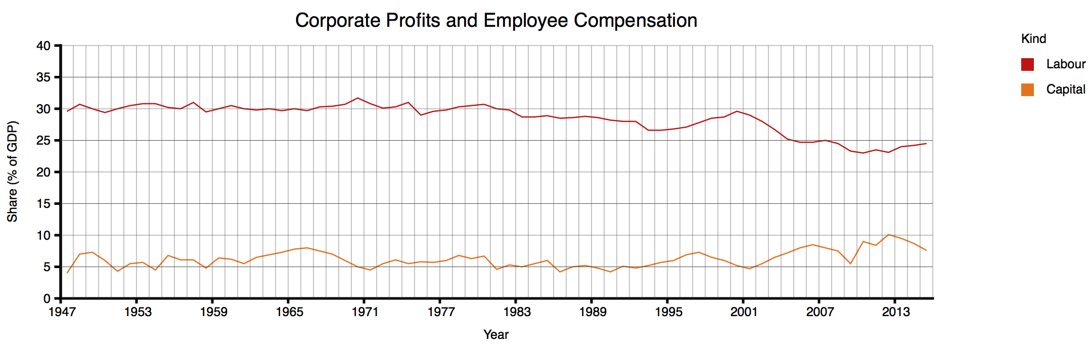
Even after I'd looked carefully at the scales and appreciated all the distortions in the original graph, I was quite shocked to see the data presented neutrally. To be clear: Grantham's textual summary of the data is accurate: a few years ago, Capital's share of GDP (from his figures) were at an all time—albeit not dramatically higher than in 1949 or about 1966—and Labor's share of GDP, a few years ago, was at an all-time low around 23%, down from 30%. But the true picture just doesn't look like the graph Gratham showed. (Again: I feel a bit bad about going on about this graph from such a good article; but the graph encapsulates a number of problematical practices that it makes a perfect illustration.)
How to Lie with Statistics
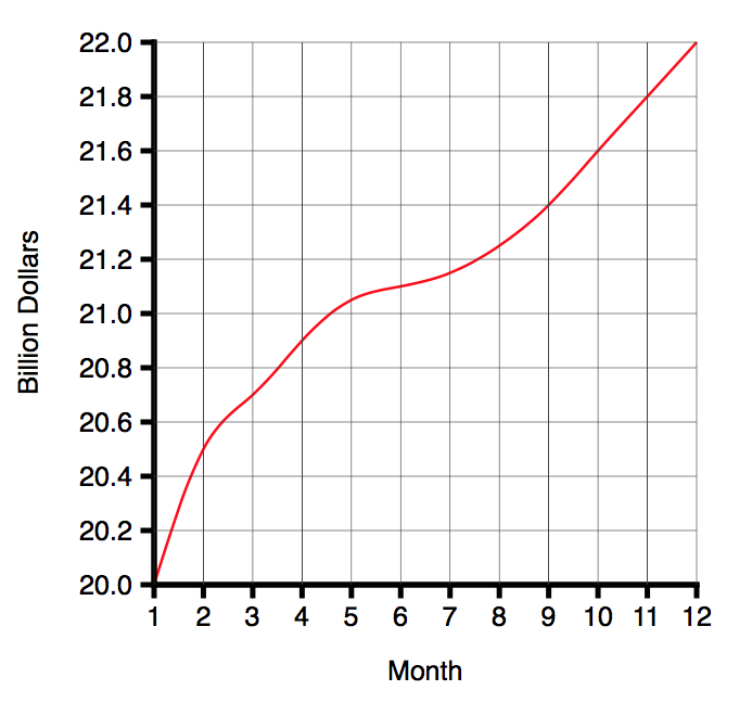
In 1954, Darrell Huff published a book called How to Lie with Statistics6. Chapter 5 is called The Gee Wizz Graph. His first example is the following graph (neutrally presented) graph:
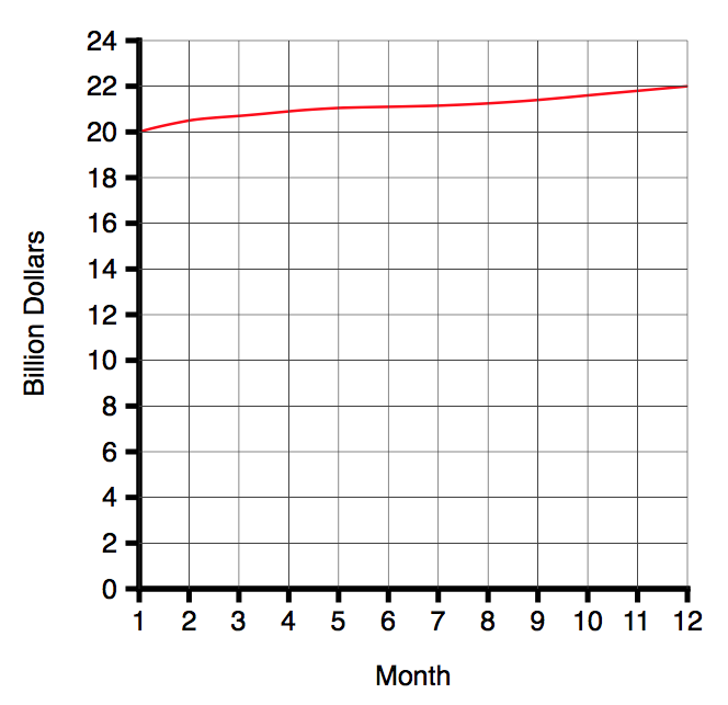
As Huff says:
That is very well if all you want to do is convey information. But suppose you wish to win an argument, shock a reader, move him into action, sell him something. For that, this chart lacks schmaltz. Chop off the bottom.
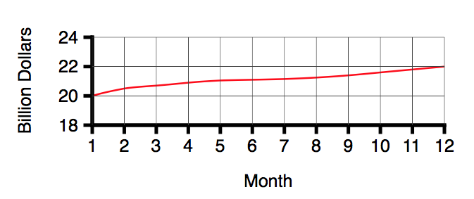
Huff continues:
Thats more like it. (You've saved paper7 too, something to point out if any carping fellow objects to your misleading graphics.)
But there's more, folks:
Now that you have practised to deceive, why stop with truncating? You have one more trick available that's worth a dozen of that. It will make your modest rise of ten per cent look livelier than one hundred percent is entitled to look. Simply change the proportion between the ordinate and the abscissa:
Both of these unfortunate practices are present in Exhibit 1, and that's before we even get to dual scales.
Errors of Interpretation
In our various overviews of test-driven data analysis, (e.g., this summary) we have described four major classes of errors:
- errors of interpretation
- errors of implementation (bugs)
- errors of process
- errors of applicability
Errors of interpretation can occur at any point in the process: not only are we, the analysts, susceptible to misinterpreting our inputs, our methods, our intermediate results and our outputs, but the recipients of our insights and analyses are in even greater danger of misinterpreting our results, because they have not worked through the process and seen all that we did. As analysts, we have a special responsibility to make our results as clear as possible, and hard to misinterpret. We should assume not that the reader will be diligent, unhurried and careful, reading every number and observing every subtlety, but that she or he will be hurried and will rely on us to have brought out the salient points and to have helped the reader towards the right conclusions.
The purpose of a graph is to bring allow a reader to assimilate large quantities of data, and to understand patterns therein, more quickly and more easily than is possible from tables of numbers. There are strong conventions about how to do that, based on known human strengths and weaknesses as well as commonsense "fair treatment" of different series.
However well intentioned, Exhibit 1 fails in every respect: I would guess very few casual readers would get an accurate impression from the data as presented.
If data scientists had the equivalent of a Hippocratic Oath, it would be something like:
First, do not mislead.
-
The Road to Trumpsville: The Long, Long Mistreatment of the American Working Class, by Jeremy Grantham, in the GMO Quarterly Newsletter, 4Q, 2016. https://www.gmo.com/docs/default-source/public-commentary/gmo-quarterly-letter.pdf ↩
-
two variables are commensurate if they are measured in the same units and it is meaningful to make a direct comparison between them. ↩
-
Tufte describes all ink on a graph that is not actually plotting data "chart junk", and advocates "maximizing data ink" (the amount of the ink on a graph actually devoted to plotting the data points) and minimizing chart junk. These are excellent principles. The Visual Display of Quantitative Information, Edward R. Tufte, Graphics Press (Cheshire, Connecticut) 1983. ↩
-
Mr Grantham works for GMO, a "global investment management firm". https://gmo.com ↩
-
chosen to use a plot, if he isn't responsible for the plot ↩
-
How to Lie with Statistics, Darrell Huff, published Victor Gollancz, 1954. Republished, 1973, by Pelican Books. ↩
-
Obviously the "saving paper" argument had more force in 1954, and the constant references to "him", "he" and "fellows" similarly stood out less than they do today. ↩