Learning the Hard Way: Regression to the Mean
Posted on Thu 20 June 2024 in TDDA
I was at the tenth PyData London Conference last weekend, which was excellent, as always. One of the keynote speakers was Rebecca Bilbro who gave a rather brilliant (and cleverly titled) talk called Mistakes Were Made: Data Science 10 Years In.
The title is, of course, a reference to the tendency many of us have to be more willing to admit that mistakes were made, than to say "I made mistakes". So I thought I'd share a mistake I made fairly early in my data science career, probably around 1996 or 1997. This is not one of those interview-style "I-sometimes-worry-I'm-a-bit-too-much-of-a-perfectionist"-style admissions that we have all heard; this one was bad.
My company at the time, Quadstone, was under contract to analyse a large retailer's customer base for relationship marketing, using loyalty-card data. We had done all sorts of work in the area with this retailer, and one day the relationship manager we were working with decided that it would be good to incentivise more spending among the retailer's less active, lower spending customers. This is fairly standard. The idea was to set a reasonably high, but achievable, target spend level for each of these customers over a period of a few weeks. Those customers who hit their individual target would receive a large number of loyalty points worth a reasonable amount of money.
We had been tracking spend carefully, placing customers on a behavioural segmentation, and had enough data that we felt relatively confident we knew what be good indivualized stretch goals for customers (wrongly, as events would prove). We set the targets at levels such that retailer should break even if people just met them (foregoing profit, but not losing much money), and estimated how many people we thought would hit the target if the campaign did not have much effect, and then estimated volumes and costs for various higher levels of campaign success.
I'm sure many of you can already see how this will go, and even more of you will have been attuned to the problem by the title of this post. We, however, we had not seen the title of this post, and although I knew about the phenomenon of regression to the mean, I had not really internalized it. I didn't know it in my bones. I had not been bitten by it. I did not see the trap we were walking into.
As Confucious apparently did not say:
I hear and I forget. I see and I remember. I do and I understand.
— probably not Confucious; possibly Xunzi.
Well, I certainly now understand.
On the positive side, our treated group increased its level of spend by a decent amount, and a large number of the group earned many extra loyalty points. I don't believe we had developed uplift modelling at the time of this work, we were very aware that we needed a randomized control group in order to understand the behaviour change we had driven, and we had kept one. To our dismay, the level of spend in the control group, though lower than that in the treated group, also increased quite considerably. In fact, it increased enough that the return on investment for the activity was negative, rather than positive. It was at this point (just before admitting to the client what had happened, and negotiating with them about exactly who should shoulder the loss1) a little voice in my head started saying regression to the mean, regression to the mean, regression to the mean, almost like a more analytical version of Long John Silver's parrot.
So (for those of you who don't know), what is regression to the mean? And why did it occur in this case? And why should we, in fact, have predicted that?
Allow me to lead you through the gory details.
Background: Control Groups
We all know that marketers can't honestly claim the credit for all the sales from people included in a direct marketing campaign, because (in almost all circumstances) some of them would have bought anyway. As with randomized control trials in medicine, in order to understand the true effect of our campaign, we need to divide our target population, uniformly at random,2 into a treatment group, who receive the marketing treatment in question, and a control group, who remain untreated. The two groups do not need to be the same size, but both need to be big enough to allow us to measure the outcome accurately, and indeed to measure the difference between the behaviour of the two groups. This is slightly problematical, because we don't know the effect size before we take action. Happily, however, if the effect is too small to measure, it is pretty much guaranteed to be uninteresting and not to achieve a meaningful return on investment, so we can size the two groups by calculating the minimum effect we need to be able to detect in order to achieve a sufficiently positive ROI.
The effect size is the difference between the outcome in the treated group and the control group—usually a difference in response rate, for a binary outcome, or a difference in a continuous variable such as revenue. Things become more interesting when there are negative effects in play, which is sometimes the case with intrusive marketing or when retention activity is being undertaken. There can be negative effects for a subpopulation or, in the worst cases, for the population as a whole. When these happen, a company is literally spending money to drive customers away, which is usually undesirable.
Let's suppose, for simplicity, that we have selected an ideal target population of 2 million and we mail half of them (chosen on the toss of a fair coin) and keep the other 1 million as controls. If we then send a motivational mailing to the 1 million encouraging them to spend more, with or without an incentive to do so, we can measure their average weekly spend in a pre-period (say six weeks) and their average weekly send in a post-period, which for simplicity we will also take to be six weeks. In this case, we will assume that there was no financial incentive: it was simply a motivation mail along the lines of "we're really great: come and give us more of your money". (Good creatives would craft the message more attractively than this.) Let's suppose we do this and that the results for the treated group of one million are as follows:
| Before | After |
|---|---|
| £50 | £60 |
This is not enough information to say whether the campaign worked, and the reason has nothing to with statistical errors: at the scale of 1 million, you can guarantee the errors will be insignificant. It's also not primarily because we are measuring revenue rather than profit, nor because we haven't taken into account the cost of action (though those are things we should do). We can see that our 1 million customers spent, on average £10 per week more in the post-period than in the pre-period (a cool £60m in increased revenue over six weeks), but we don't know about causality: did our marketing campaign cause the effect?
To answer this, we need to look at what happened in the control group.
| Before | After | |
|---|---|---|
| Mailed (Treated) | £50 | £60 |
| Unmailed (Control) | £50 | £55 |
We immediately see that the spend in the pre-period was the same in both groups, as must be the case for a proper treatment-control split. We also seee that the spend in the control group rose to £55.
We now have enough evidence to say for with very high degree of confidence that the treatment caused a £5 per week increase in spend, but that some other factor—perhaps seasonality, TV ads, or a mis-step by our competitors—caused the other £5 increase per week across the larger population of 2 million customers. I should emphasize that this is a valid conclusion regardless of how the population of 2 million was chosen, as long as the treatment-control split was unbiased.
Behavioural Segmentation
Now let us take a similar treatment group drawn uniformly, at random, from a larger population of 10 million, We segment the treatment population by average weekly spend in the pre-period and plit the increase or decrease in spend, between the pre- and post-periods in each segment for our treatment group. The graph below shows a possible outcome.
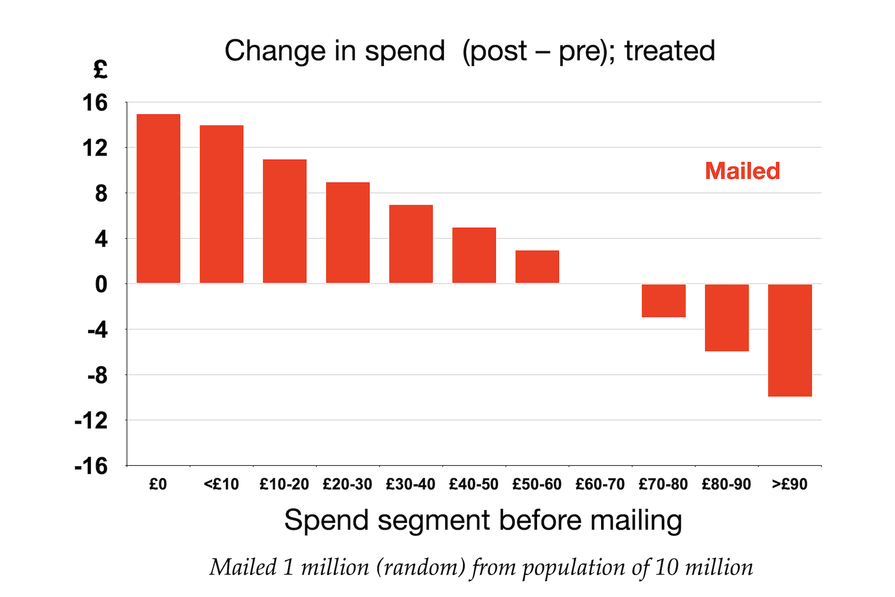
For people who are not steeped in regression to mean, this graph may appear somewhat alarming. Depending on the distribution of the population, this might well represent an overall increase in spending (since probably more of the people are on the left of the graph, where the change in spend is positive). But I can almost guarantee that any marketing director would declare this to be disaster, saying (possibly more colourful language) "Look at the damage you have wreaked on my best customers!"
But would this be a reasonable reaction? Would it, in fact, be accurate? At this point, we have no idea whether the campaign caused the higher-spending customers' spend to decline, or whether something else did. To assess that, we need once more to look at the same information for the control group (9 million people, in this case). That's shown below.
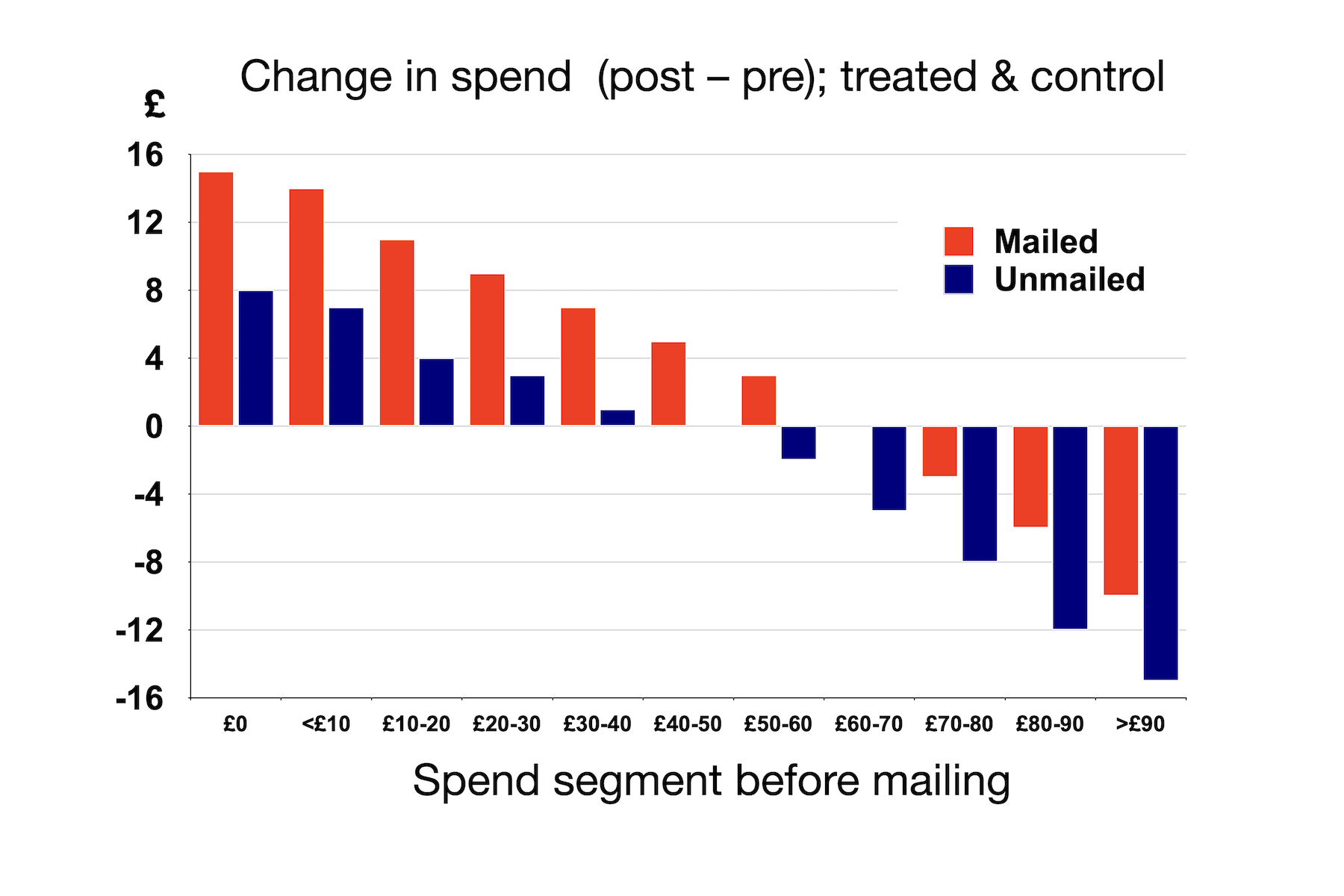
What we clearly see is that in every segment the change in spend was either more positive or less negative in the treated group than in the control group. So the campaign did have a positive effect in every segment. Not so embarrassing. (If only this had been our case!)
Regression to the mean
To understand more clearly what's going on here, it's helpful to look at the same data but focus only the control group.
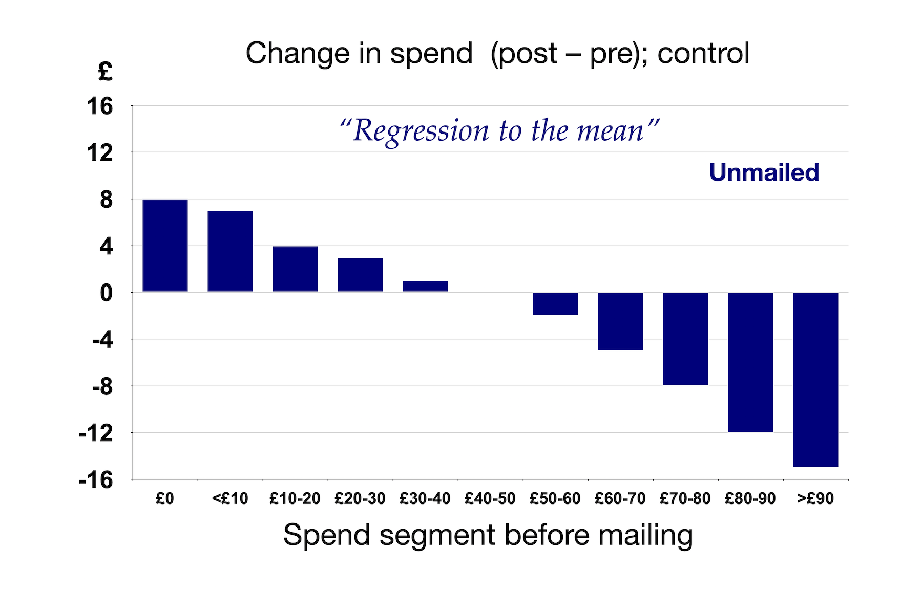
Remember, this is the control group: we have not done anything to this population. This is a classic case of regression to the mean. I would confidently predict that for almost any customer base, if we allocate people to segments on the basis of a behavioural characteristic over some period, then measure that same characteristic for the same people, using the same segment allocations, at a later period, we would see a pattern like this: the segments with low rates of the behaviour in question in the first place would increase that behaviour (at least, relative to the population as a whole), and the people in the segments that exhibited the behaviour more would fall back, on average.
Why?
Mixing Effects
When you segment a population on the basis of a behaviour, many of the people are captured exhibiting their typical behaviours. But inevitably, you capture some of the people exhibiting behaviour that is for them atypical.
Consider the first bar in the example above—people who spent nothing in the six weeks before the mailing. Ignoring the possibility of people returning goods, it is impossible for the average spend of this group to decline. In fact, if even a single person from this group buys something in the post-campaign period, the average spend for that segment will increase. In terms of the mixing I am talking about, some of the people will have completely lapsed, and will never spend again, while others were in an atypically low spending period for them: maybe they were on holiday, or trying out a competitor or didn't use their loyalty card and so their spending was not tracked. The thing that's special about this first group is that they literally cannot be in an atypically high spending period when they were assigned to segments, because they weren't spending anything.
It's less clear-cut, but a similar argument pertains to the group on the far right of the graph. Some of those are people who routinely spend over £90 a week at this retailer. But others will have had atypically high spend when we assigned them to segments: maybe they had a huge party and bought lots of alcohol for it, or maybe they shopped for someone else over that period. With the highest-spending group, there will probably be a small number of people whose spend was atypically low during the period we assigned them to segments, but there are likely to be far more people for whom this spend was atypically high at the right side of the distribution. So in this case, we can see it's likely that the average spend of these higher-spending segments will decline (relative to the population as a whole) if we measure them at a later time period.3
For people in the middle of the distribution, the story is similar but more balanced. Some people will have their typical spend where we measured it, and there will be others whom we captured at atypically high or atypically low spending periods, but those will tend to cancel out.
These mixing effects give the best explanation I know of the phenomenon of regression to the mean. It is always something to look for when you assign people to segments based a behaviour and then look for changes in the people in those segments a later time.
So how did we lose so much money?
The reason our campaign worked out so poorly was that we did not take into account regression to the mean when we set the targets, because we didn't think of it. Because we targeted more people with below-median spend than above-median spend, regression to the mean meant that although spend increased quite strongly among our treated customers, it also increased quite strongly for the control group in each segment. In that regard, the uplifts were less similar across the spend segments that I have shown here; something, in fact, that I now know to be characteristic of retail unike in many other areas. The most active shoppers are often also the most responsive to marketing campaigns.
The campaign produced an uplift in all segments, but much more of the increase in spend than we expected was due to regression to the mean in the population we targeted, with the result that value of the loyalty points given out significantly exceeded the incremental profit contribution from the people awarded those points.
This was a tough one. But at least I will remember it forever.
-
Without getting too specific, the loss was a six-figure sterling sum, back when that was an more significant amount of money than it is today. It was not really a material amount for the retailer, which had a significant fraction of the UK population as regular customers; but it was a highly material amount for Quadstone: more, in fact, than the four founders had invested in the company, the probably less than our entire first-round funding. And retailers don't get to be big and dominant by treating six-figure losses with equinimity. ↩
-
Uniformly at random means that, conceptually, a coin is tossed or a die is rolled to determine whether someone is allocated to the control group or the treated group. The coin or die does not need to be fair: it's fine to allocate all the 1's on the die to control and all the 2-6's to treated, or to use a weighted coin, as long as the procedure does use any other information to determine the allocation. For example, choosing to put two thirds of the men in control (chosen randomly) and only one third of the women in control is no good, because now, if there's a difference, it is hard to easily separate out the effect of the treatment from the effect of sex. (If the volume suffices, you could assess the uplift independently for men and women, in this particular case, but that quickly gets complicated, and there is more than enough scope for errors without such complications.) ↩
-
One possible confusion here is that I'm describing a static, rather than a dynamic, segmentation here: people are allocated to a segment on the basis of the spend in the pre-period and remain in that segment when assessed in the post-period. If we reassigned people on the basis of their later behaviour, we would not see this effect if the spend distribution were static. ↩